writing about tech

Month: April 2015

Apple Watch Review

Smartwatches are incredibly hard to review. I’ve reviewed two others now, and I’m still not really sure how to approach it.

As a reviewer, you typically write with the assumption that the reader has, at the very least, accepted the value of the product category, and is simply deciding which product in that category they want. If you’re reviewing a smartphone, it’s a fair assumption that the person reading is already sold on the very concept of smartphones. Smartwatches are different. Many people – even people in the tech world – don’t see the value.

While I have wavered from time to time on the value of smartwatches, I generally err on the side of finding them useful. It’s difficult to explain why, however, because it’s all about the little differences they make in your day – each of which, taken individually, don’t sound terribly compelling. Today, my Pebble-owning co-worker excitedly explained how great it was to get his two-factor authentication codes directly on his wrist, without having to dig out his phone to read them. It’s one of those paradoxes that simultaneously thrill smartwatch owners while confusing cynics. “That’s it?”, they ask. Obviously, that’s not it, but it’s a fair question. If smartwatches are so great, why are they so difficult to sell people on? For me, it’s all about form factor.

My life is full of screens. My laptop screen, my tablet screen, my smartphone screen, and my smartwatch screen. All of them serve fundamentally different purposes, and are ideal for different types of activities. My laptop is better than my tablet for writing or coding or browsing, but not for traveling, or using in bed, or gaming, or using on a stationary bike or treadmill. My tablet is better than my smartphone at most things, other than photography, but isn’t something I want to haul with me from place to place.  My smartphone is better than my smartwatch for most activities that take longer than a few seconds – writing a longer e-mail or text, or browsing Facebook or Twitter.

So why a smartwatch? Well, stop and think for a moment: how many times do you dig out your phone for an activity that only actually requires a few seconds of passive interaction? Checking the time. Checking the weather. Checking your calendar. Checking your notifications. Starting a timer. Checking an item off a to do list. Creating a reminder. Reading a text. Reading an e-mail. Arming an alarm system. Starting to track a bike ride. Checking the stats during that bike ride. Playing or pausing audio. Double-checking directions to wherever you’re going. Paying for something. Identifying a song that’s playing. These are all things I do multiple times a day, and, honestly, a smartphone isn’t the ideal form factor for those. They sound trivial, because they are mostly passive, quick interactions, but they’re also the things I probably do most with my phone, and as average phone size continues to get bigger, taking out an oversized device for a trivial task feels increasingly ridiculous. As with many things in life – the little things make all the difference. Little conveniences, all day, every day, add up to something I like having in my life.

That’s almost 500 words, and I haven’t even really talked about the Apple Watch. There’s a reason for that: it’s because the Apple Watch is a smartwatch. It’s a damned good smartwatch, probably the best I’ve ever used, but it doesn’t sell the form factor in a revolutionary new way.

I don’t think it has to, though.  Apple won’t change the wearable world because they reinvented the product category, but rather, because they will introduce the product category to millions of people who may never have tried a smartwatch otherwise – and I think many of those people will be pleasantly surprised by how much they like wearing one.

The hurdle for many, and rightfully so, is the price. After the $149 Pebble, I balked at spending $249 on a Moto 360 last year, so I certainly understand the hesitation at the Apple Watch’s $349/$399 asking price. The good thing is that it feels like a device worth what you’re paying for it, but still, that’s a lot to ask for a device in a still-largely-unexplored category.

I was initially skeptical of the design, but it grew on me after seeing it in person, and the positive impressions have continued. Unlike some Android Wear watches, which impressively imitate  “regular” watches, the Apple Watch makes no attempt at doing so – for better or worse, it  undeniably looks like an Apple product. This is almost certainly intentional; Apple doesn’t want their watch to be mistaken for a regular watch.  They want people to immediately recognize it’s an Apple Watch. While understandable from a branding perspective, it also highlights one of Android Wear’s chief advantages: choice. Given another a year or two, I imagine almost anyone will be able to find an Android Wear device that matches their taste. If you want an Apple Watch, you better like the Apple Watch.

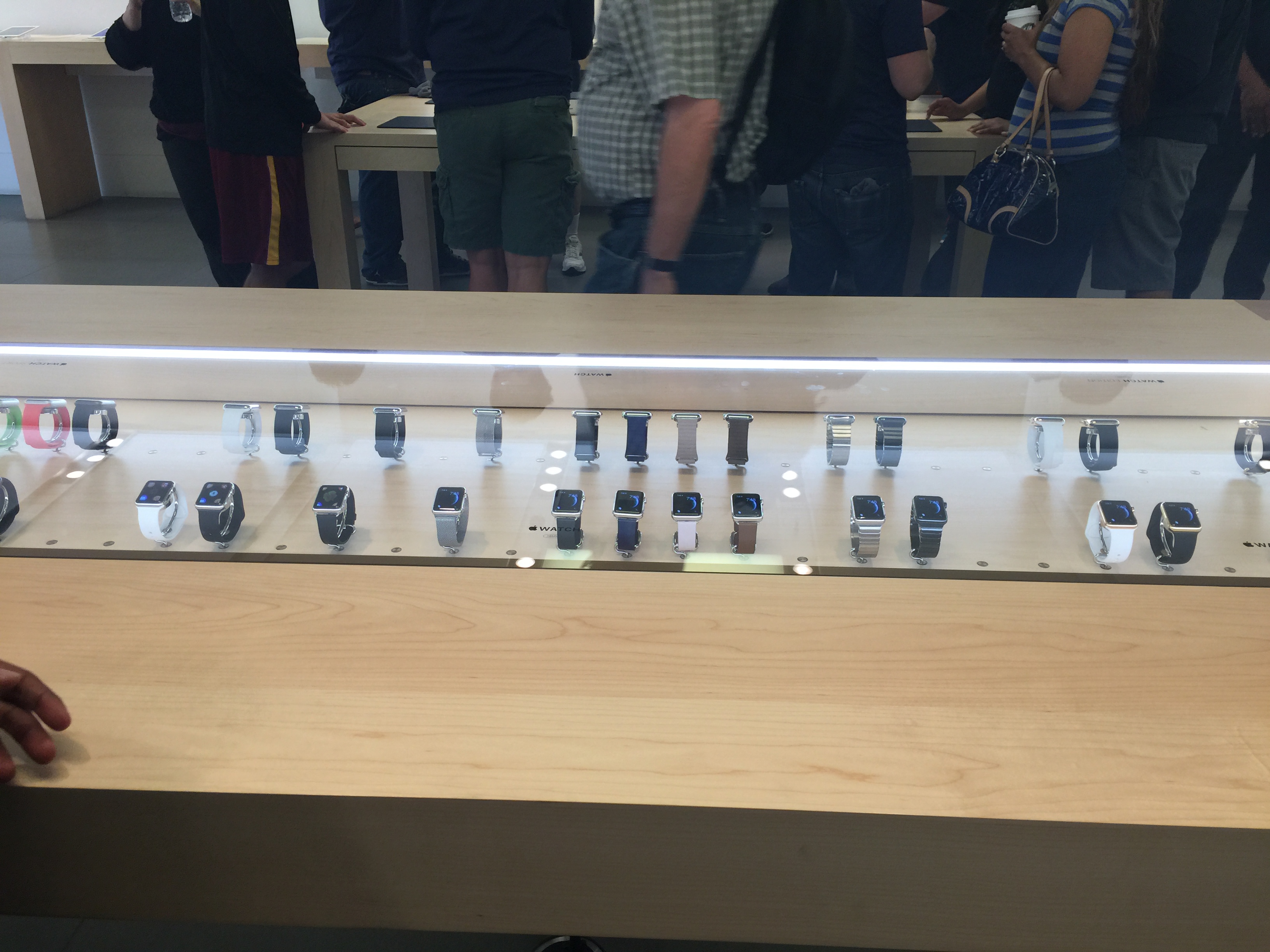
There is one area of personalization where Apple does win, though, and that’s with watch bands. While some Android Wear devices might let you swap in standard watch bands – again playing in their attempts to mimic a regular watch – Apple has found an incredibly slick, user-friendly way to easily swap bands within seconds. Whatever you think of the Apple Watch, don’t doubt this: Apple (and their third-party partners) are going to make an obscene amount of money selling bands to people. I’m already planning on buying at least one additional band – Milanese Loop – and swapping it out with the Sport band after my workouts. That’s absolutely insane, because I’m not a fashionable person, and this isn’t something I’d even consider doing with a regular watch. But Apple makes swapping the bands so easy, and the Milanese is ridiculously nice.

Fortunately, if you’re more sane than me, the band that the Sport model comes with is surprisingly good. Apple calls it “fluoroelastomer”, but I just call it “incredibly comfortable”. It’s the first watch band I’ve worn in a long time that I can actually forget I’m wearing, and that includes the pretty-great leather band that came with the 360. The only frustrating thing is that I’d prefer the black color, but for some inane reason, Apple refused to sell the silver aluminum Sport with the black band. So white will do, for now.

As I mentioned above, my life is full of screens, and the Apple Watch’s is one of the nicest among them. It’s the first smartwatch I haven’t been able to see pixels on, and AMOLED – with its ability to only light up the pixels in use while keeping the rest of the screen black – continues to be the ideal screen technology for a smartwatch from both an aesthetic perspective and a functional perspective.

One more thing about the hardware: I laughed at the digital crown when it was announced, but now I find myself using it constantly. It’s not a “revolutionary” control mechanism by any stretch of the imagination, but as a button that doubles as a way to quickly scroll content, it’s certainly a nice-to-have.  In the last day or so, though, I feel like it’s gotten slightly less responsive on initial use – like it “sticks” for a moment. It’s certainly tolerable, but hopefully it won’t get much worse.

As many doubt as I had about the hardware, they paled in comparison to my doubts about the software. I questioned Apple’s apparently app-centric approach, while praising Android Wear for its comparative simplicity. Once again, actual usage has mitigated those doubts – mostly.

While much has been made about apps on the Watch, they’re actually not as front-and-center as I feared. You could legitimately live in the watch face and get most of the functionality you’d want, as the watch face hides the two most important features – missed notifications, which are available with a swipe down, and Glances, which are available with a swipe up.

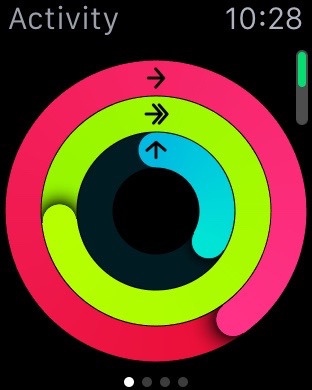
Glances are one of my favorite parts about Watch OS. They give me the information I care about most, while also acting as a shortcut to launch the app if need a bit more or want to interact with the information. Dark Sky tells me the current temperature and the weather for the next hour. Wunderlist shows me my next task. Activity shows me my progress towards my fitness goals. For this reason, I’m also incredibly picky about what gets to go in my Glances area – if I have to go through too many other Glances to get to the one I care about, then much of the point is lost.

Notifications, on the other hand, are about the same as you’ll find on Android Wear, right down to the fact that they inherit the notification actions you’d get on your phone. With Inbox, I can mark an e-mail as “Done” right from the notification on my phone – same with the Watch, and exactly the same as Android Wear. The only exception is with some of Apple’s first-party apps, which generally allow you a bit more interaction than third-parties do. For example, if you’re talking to someone over iMessage, you actually see the same “typing” indication on the watch that you’d see on your phone. It’s a small touch, but it’s the sort of attention to detail that is prevalent throughout the hardware and software.

Otherwise, I’d say Watch OS is actually a bit behind Android Wear in the area of notifications – as-of right now, you can only dictate replies to messages that come in through the default Messages app, so no responding to Hangouts messages or Facebook Messengers messages from your wrist. This is an obnoxious limitation that I hope is dealt with sooner rather than later.

There are some aspects of the Watch I prefer to other smartwatches, though. The “taptic” engine, despite the ridiculous name, really is a step above the vibration engine found in other devices. The same way the Force Touch trackpad actually feels like clicking, the “taptic” engine genuinely feels like something is tapping your wrist to get your attention. The look on people’s faces when I put my watch on their wrist and send myself a message is pretty delightful. The other nice thing: when you get a notification, your wrist doesn’t light up. You just get the tap, and you can either raise your wrist to immediately view what came in, or just check on it later. This has made the smartwatch experience far less distracting to me and those around me, and as an added bonus, people can no longer awkwardly read incoming messages off of my wrist.

Speaking of the screen-on-on-wrist-raise feature, it works…mostly. It might be a little more consistent than the Moto 360 was, but there are certainly times where I go to check something and it misbehaves.  It does seem to false trigger less often, though – for example, it doesn’t randomly turn on and off when I’m driving around.

So, notifications above the watch face, Glances below it – what about the watch faces themselves? Well, some are great, and some are pretty-but-useless, and some are just useless. Fortunately, I (eventually) figured out how to delete the ones I didn’t care about, so now I’m down to Utility (somewhat pretty, mostly useful), Modular (not really pretty, but has the most information), and four others that are very pretty but almost entirely useless.

What makes a watch face useful? What is quite possibly my favorite feature of the Watch – the complications. While Apple currently doesn’t support third-party watch faces, and some suspect they never will, the existence of complications helps soften the blow. On my Modular watch face, I currently have: time (obviously),  date, my next calendar appointment,  current temperature, battery level, and, perhaps my personal favorite, my activity level for the day so far. The activity level information is something I desperately wanted in Android Wear, so I’m pleased it’s a default option on the Watch.

Perhaps the best thing about complications, though, is that they act as shortcuts to full apps. The current temperature is sometimes what I want, but sometimes I want the forecast for the rest of the day – tap on the temperature and I’m in the Weather app. Next calendar entry is great, but what’s my agenda for the rest of the day? Tap on the calendar entry and I’m there. It’s hard to believe that the Apple Watch is, far as I know, the first to do something that seems so obvious.

As for those full-apps? Well, it’s a mixed bag. Like watch faces, some are great, and some are useless? Calendar? Great! Here’s my schedule. Remote? Great! Controlling my TV from my wrist never gets old. Photos? …thanks but no thanks. Twitter? Why, why would I want Twitter on my wrist? Instagram? God no.  Wunderlist? Great! I can jump in and mark something as completed – something I wanted to do on my Moto 360, but a proper Wunderlist app wasn’t available during my months spent with it. Never doubt Apple’s ability to bring third-party apps to the table in a way competing platforms just can’t seem to do, for whatever reason.

Performance of those apps is occasionally slow, as they aren’t running natively on the watch, but rather are just fancy extensions of something running on your phone. However, I’ve found performance generally acceptable, and far better than the initial reviews led me to believe. I’m not sure if Apple made some optimizations prior to the retail release, or if tech journalists are just less patient than me.

We’re now over 2000 words in, and I still feel like there’s a lot more to cover. I could probably go on for another 2000, but instead, I’ll shotgun out some random thoughts I’ve had over the last few days.

  • Force Touch? It…usually works, but it’s frustrating when it fails to. Also not sure if I like the general interface paradigm of hiding actions behind a Force Touch, as it basically requires the user Force Touch every screen to see what they can do. A subtle visual indicator would be nice.
  • Digital Touch? I haven’t drawn anything, or sent my heartbeat to anyone, so I can’t really say. I’ve sent a couple of animated emoji, and they send as animated images to non-Apple Watch owners. Cute, but basically useless.
  • Siri? Mostly great, surprisingly. Way better than on the phone. Dictation still seems a bit slower than Google’s dictation on Android and Android Wear, but it’s acceptable.  “Hey Siri” detection is significantly less reliable than “OK Google” detection, for whatever reason – however, it’s available from everywhere on the watch, not just the watch face, so that helps make up for it. Perhaps more annoying is that Watch OS lacks Android Wear’s “automatically time out and complete the activity” option, so if I create a reminder or dictate a message, I still have to tap “Okay” to finish creating it. Clunky and annoying – it’s obvious Android Wear was built more around voice as a primary input mechanism than the Apple Watch was. Watch OS seems to know that voice input is important, but at times still treats it as a second-class citizen.
  • Taking a phone call on your wrist? Feels kind-of cool the first time you do it, but not something I’d envision doing on a regular basis.
  • The screen is surprisingly easy to see in the sun. Early reviews said otherwise, though that could be because the Apple Watch Sport’s screen apparently performs better in sunlight than the Apple Watch’s.
  • Battery life is more or less the same as it was on my Moto 360. It certainly lasts longer while exercising, and I no longer feel obligated to charge it after a workout to get a full day out of it. Ittill goes on my charger when I get in the shower, because the charger’s already on my nightstand, and where else would it go? Speaking of the charger – I like that it’s magnetic and wireless, but still miss the elegance of the 360’s Qi charging dock, not to mention its use of a wireless charging standard.
  • I like that the watch automatically locks itself when removed from your wrist. Given that anyone with my watch could easily trigger an Apple Pay transaction, this seems like a particularly elegant solution to a necessary feature.
  • Speaking of which: Apple Pay was born to live on the Apple Watch. Apple Pay (and NFC payments in general) are already pretty cool, and while paying with your phone is generally faster than paying with a credit card, paying with something that’s already on your wrist is noticeably faster than both.
  • The watch can be set to unlock to the last used app, which is useful if you’re doing something like using the watch as a remote for an Apple TV, or monitoring an active workout. As a bonus, all apps have the time in the upper right corner, so it’s still useful as an actual watch when you aren’t on the watch face itself. In a way, it becomes a makeshift whatever-activity-you’re-doing-centric watch face.

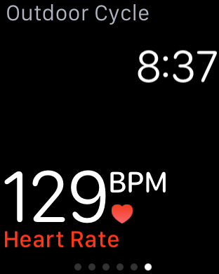
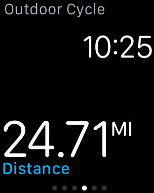
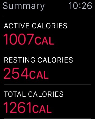
And then, of course, there’s the fitness stuff. I could write a whole post about that – in fact, I already have – but the long and short of it is that it’s exactly what I’ve wanted out of a fitness tracker for years. It passively tracks my movement throughout the day, while also actively and accurately tracking my heart rate during exercise. The only time I’ve seen it struggle to read my heart rate is while dancing, which Apple explains with: “Rhythmic movements, such as running or cycling, give better results compared to irregular movements, like tennis or boxing.” It’s not that it stops working entirely during those activities, just that it seems to take a reading less often. There are, of course, dedicated fitness trackers that will also read your heart rate – but as someone who has already decided they want to wear a smartwatch, I’m not really interested in wearing something on both wrists.

Most importantly to me, MyFitnessPal’s latest version will update my calorie allocation for the day based on the activity recorded by the watch, and the Fitbit app can be set to record my steps based on my iPhone rather than the Fitbit hardware.  All of this means I finally have what I wanted since the original Pebble – a smartwatch/smartphone combination that will allow me to retire my Fitbit One without sacrificing MyFitnessPal functionality or the social aspects of the Fitbit ecosystem.

So where does that leave us? The Apple Watch is, in my experience, a paradoxical device. Sometimes it feels like Apple’s most-polished first-gen product ever…until it doesn’t. 95% of the time, it’s a smooth, reliable experience…but then Siri will freak out. Or a poorly written Glance will cause my watch to reboot. Or I’ll show the watch to someone and it won’t let me enter my passcode to unlock it without restarting it.

Bottom line: the odd quirk aside, it’s the best smartwatch and the best fitness tracker I’ve ever used, but the price is pretty hard to swallow unless you want both types of devices. Most people probably shouldn’t buy it just as a smartwatch, or just as a fitness tracker – it doesn’t do enough beyond what other smartwatches do to revolutionize the category and push into “objectively useful for everyone”, and it’s too expensive to buy as solely a fitness tracker. 

For most people, it’s hard not to recommend waiting for the next generation – not because this one isn’t good, but because the next one will probably be better and cheaper. If nothing else, the next generation will drive down the cost of this generation. It’s not that it isn’t great or useful – it’s pretty great and pretty useful – but rather, that it’s not necessarily $349 worth of useful. At $299, it becomes more reasonable. At $249, it’d be much, much easier to recommend.

But, if you have an iPhone, and you love gadgets – it’s a pretty damn cool gadget, so that might well be enough. If you love gadgets and have an interest in fitness tracking, like me, then it basically sells itself.  So if the question is “Should I buy?”, the answer for most people is “probably not”. But if the question is “If I do buy it anyway, will I like it?”

Yeah, I think you probably will.

25 Miles on a Bike with the Apple Watch and RunKeeper

IMG_1434


Introduction

I’ve been a bit obsessed with gadgets and fitness tracking since I discovered RunKeeper on the iPhone 3G in 2008. It wouldn’t run in the background, and it murdered my battery, but I still loved tracking the stats and maps of my walks and bike rides. It was primitive, and it was messy, but I had a taste of how gadgets could encourage me to be more fit, and I wanted more.

Since then, things have grown a bit more sophisticated, though still not as much as I’d like. Other tracking services came along, but I stuck with RunKeeper but, well, it has all my data, and I have a community on there. What I didn’t love about RunKeeper is that I had to fish out my phone every time I wanted to interact with it or view my current stats.

Enter the original Pebble. I was mildly intrigued by the possibility of notifications on my wrists, but I was excited to finally have an interface for RunKeeper. I missed the original Kickstarter, but managed to grab one at Best Buy, and it was my first step into a larger world.

I’ve also tried the Moto 360, and now the Apple Watch.  In addition, I use a Fitbit One, which is great as a generic fitness tracker and social platform, but generally a bit lacking when it comes to accurately tracking bike rides, and obviously can’t work with RunKeeper at all. My holy grail fitness tracker has always been one that could replace my Fitbit and my Pebble, could accurately track my heart rate,  all while still acting as a display for RunKeeper and performing other smartwatch-y functions.

The Ride

So, today, I took my new Apple Watch on a 25 mile bike ride to find out if it is truly the Chosen One. The short answer? Not quite – but it’s really, really close, and all-but-one of the failings are on the software level, not the hardware level – so things could change.

Let’s cover the hardware failing first – the first-gen Apple Watch has no built-in GPS. For many, that could very well be a deal-breaker. If you still have to carry your phone, why bother? Personally, I like to have my phone with me, especially on bike rides, in case something goes wrong. It’s also how I listen to podcasts – shout outs to The Adventure Zone and the Android Central Podcast for keeping me company today. So, relying on my phone’s GPS is just fine for me.

Software-wise, the biggest issue is that third-party apps can’t tap into the Apple Watch’s heart rate monitor, so I have to use both RunKeeper and the built-in Workout app if I want to get heart rate information. That’s the bad news. The good news is that a double-tap of the digital crown will switch between your last two apps, so it’s really easy to jump between RunKeeper and Workout. It makes it harder to manually pause my workouts, but both apps automatically pause if I stop for a short time, so that’s not a huge deal.

The other software issue is the RunKeeper watch app itself, which is the most bare-bones version of RunKeeper I’ve ever  it. The actual during-activity display is fine, but you can’t change the type of activity you want to do from the launch screen, so you have to dig out your phone for that. It’s a dumb limitation, and one I have to imagine will be fixed sooner rather than later, but if you try and use the app today, that’s what you get.

IMG_1440

That’s the bad stuff.  Now let’s talk about the good stuff, which is basically: everything else. It’s by-far the best smartwatch I’ve used for working out – it combines most of my favorite aspects of the Pebble and the 360, while correcting some of the issues with both.

Vs. The Pebble

The Pebble’s RunKeeper integration and fitness tracking functionality are appropriately simple. The RunKeeper app will display your current stats, and will pause the run if you hit the side button.  This is one case where the Pebble’s always-on interface truly shines, as I can always see my information and it’s always visible regardless of lighting conditions. The Pebble itself serves as a basic pedometer, which tracks my runs well enough, but fails when it comes to bike rides.  That, combined with the lack of a heart rate monitor, means it’s a fantastic RunKeeper display, but too basic as a fitness tracker.

Vs. The Moto 360

I’ve already extensively covered my use of the Moto 360 as a fitness tracker, so I’ll focus on the differences between it and the Apple Watch.  My biggest issue with the 360’s RunKeeper integration was that, while it kept the screen always on, it was usually too dim to see without tapping on the screen, and the usual “wake the watch up” wrist gesture wouldn’t work to turn the screen on. This is likely to save battery life, but having to tap every time I wanted to view my stats wasn’t a great experience.

The Apple Watch, in comparison, just times the display out like normal, which sounds worse, but there’s one major difference – you can set the Apple Watch to display the last-used app on wrist-raise, so your fitness stats are still just a glance away. While you can turn the display off on the 360, if you raise your wrist, you’re going back to the watch face, meaning the stats you care about at least a swipe and tap or two away. Not the end of the world, but also not ideal.

The other big difference is the heart rate monitor. While the 360 will passively monitor your heart rate during a workout, which is great, the Apple Watch goes one step further by surfacing that information and taking it more frequently, so you can accurately judge your level of effort mid-workout.

File Apr 25, 12 24 14 PM

While I don’t have the equipment to judge how accurate the heart rate info is,  but others who do have vouched for its accuracy:

At the end of three workouts, both the Polar and the watch reported similar average beats per minute. That’s far more accurate than the Fitbit Charge HR and Microsoft’s Band.

The only real issue here again seems to be software-related – while Apple uses the heart rate information to calculate calorie burn, it doesn’t seem to be surfaced anywhere else. I’d love to see how my heart rate varied during a workout.

Finally, battery drain during the workout was (obviously) more substantial than it is on the Pebble, but better than the 360, even with me constantly checking my  heart rate. Over the course of the nearly-two-hour bike ride, I lost about 30%, and I could probably mitigate that by not checking my wrist as often. The only real downside is that it means I’ll likely need to charge after a morning workout if I want to make it through the rest of the day, but that’s no different than my experience with the 360.

Other bits and pieces

Some other things of note:

  • The Exercise app and RunKeeper app recorded almost the exact same distance, which is unsurprising as I imagine the Exercise app is using the phone to calculate distance.

IMG_1437 IMG_1436


  • Calorie burn between the Apple Watch and RunKeeper weren’t really in sync, though strangely, my Apple Watch and FitBit were quite close. I also like that the Apple Watch differentiates between Active and Resting calories. Given that the Watch has my heart rate information, I’d imagine its calorie estimation is more accurate.


IMG_1439 IMG_1444


  • I love that the Apple Watch differentiates between reaching your active calorie burning goal and staying active the rest of the day. The fact that the Watch expects you to stand at least once an hour definitely calls out folks like me, who are inclined to go for a morning run or ride, but then use that as an excuse to remain mostly-stationary the rest of the day. In the image below, the blue circle screams: You spent two hours on the bike, and that’s awesome, but you aren’t done yet!

IMG_1439

IMG_1442


  • Apple’s Activity app on both the phone and the watch is actually pretty slick, complete with Achievements, but it’s going to be fairly limited until some social aspect is incorporated – after all, what’s the point of earning trophies if I can’t compare those trophies with my friends? I could probably stop wearing my Fitbit at this point, except for the social ecosystem I’ve built there. It’s fun to compare my days and weeks with others, and competition encourages you to get just a little more movement in.
  • I was worried about screen visibility in the sunlight, but I was able to view my stats without a problem in Arizona’s morning Asun. Some of the illusion is lost, however, as you can easily see where the screen ends and the bezel begins, which is much harder to do when you’re indoors.

Conclusion

So, 25 miles later, where does that leave us?  I was expecting trade-offs similar to what I’ve seen with the Pebble and the Moto 360, and while there are a few, they are relatively minor, and nearly all of them can be fixed with software changes. It’s easily the most capable wrist-worn fitness tracker I’ve used, and we’re only day two into it being publicly available. It’s hard to imagine where we’ll be in a year or two, with or without new hardware. This is the first smartwatch I’ve worn that legitimately convinces me I could ditch my Fitbit, and I would, if it weren’t for the social aspects of Fitbit and the tie-in with MyFitnessPal, which I use to track calorie intake. Of course, if I lose my Fitbit, I’m much less likely to replace it now than I was before.

Here’s what I’d like to see in the future:

  • I won’t even need to start the Workout app, as the Watch will figure out what I’m doing based on accelerometer activity and track accordingly.
  • The RunKeeper app would be able to access the heart rate monitor, and I could view my heart rate data on RunKeeper the same way you can if you pair a heart rate monitor to your phone.
  • My active calorie burn information would be sent to MyFitnessPal, so that my calorie goals for the day would be adjusted accordingly.

Still, all of this is software. Hardware-wise, the pieces are already there for my ideal fitness wearable, and even today, it’s more capable than most-if-all of its direct competitors. Of course, it’s also more expensive, but, well, that discussion will have to wait until a full review.

(Addendum: I’d like to thank Apple on behalf of bloggers everywhere for providing an easy way to take and sync screenshots on an Apple Watch. No more awkwardly taking photos of my wrist for these sorts of posts!)

A new smartwatch has arrived

IMG_1423

IMG_1424

IMG_1425

A few (very, very quick) impressions:

  • Build quality, even on the Sport model, is unsurprisingly fantastic.
  • Setup process was fairly straightforward, though I continue to wonder how fast non-techies will take to it. Even something as simple as configuring your watch face may cause people to people stumble. Makes me wonder how many Apple Watches will be left on the default face configuration.
  • Speaking of faces: most of the built-in ones are actually pretty lame, though there are a few standouts, and you’ll probably find something you like. Solar, Astronomy, and Motion are all gorgeous, though none of them have complications, which limits their actual utility.
  • The UI seems mostly snappy, though it has the occasional Moto 360-esque hiccup. It’s smoother than I expected based on reviews, for whatever that’s worth.
  • Speaking of which – third-party app performance seems to vary, but generally are surprisingly different. From reviews, I expected a disaster, but most of the ones I care about (Wunderlist, Dark Sky, Alarm.com, Evernote) all seem perfectly usable.
  • still can’t believe there’s no Reminders app. Come on. At least I can use Wunderlist or Evernote for shopping lists, I suppose.

More impressions coming in the next few days! I’m excited to see how it holds up during a long bike ride, and if my leg is feeling better, I’ll take it out for a run soon. I’m also curious how it tracks my Just Dance “workouts”.

Watch This: 4 Weeks with the Apple Watch

Today I stumbled across this video, and thought it was pretty great:

Basically: if you’ve already used a smartwatch, and aren’t already sold on the concept, then the Apple Watch doesn’t do anything new or amazing enough to win you over. Personally, as someone who loved his Moto 360, I’m pretty excited to see Apple’s take on the same ideas.

While I know smartwatches aren’t for everyone, my experience is that people tend to only realize their usefulness after having one. What the Apple Watch could do, that other smartwatches so far haven’t, is win over otherwise-skeptical customers on brand name alone. A smartwatch is more than the sum of its parts, and I think millions of people are going to try the Apple Watch and be pleasantly surprised. In a way, the Apple Watch may very well be the best thing to happen to Android Wear since Android Wear was announced.

Today I tried on an Apple Watch

Although I’ve already pre-ordered an Apple Watch, I still wanted to try one on, just in case the experience was so underwhelming I could cancel ore-ory pre-order before I shipped. Also, I was curious what the whole “trying on” experience was like.

IMG_1360

  1. I showed up for my appointment around 3:15, and the store was fairly packed, although I think that’s pretty common for the Apple Store on weekends.
  2. The person helping me seemed fairly knowledgeable about the Watch, though because I’m a huge nerd he wasn’t really able to tell me anything I didn’t already know.
  3. They didn’t have the exact model I ordered – a 42mm Silver with White Sport Band – but I was able to try the 42mm Space Grey, and it felt quite nice. It’s a bit smaller than I expected, which reassured me that I’d made the correct choice in ordering a 42mm – the 38mm is just a bit too small for me. I can see how it’d be perfect for someone with smaller wrists, though – the Apple Watch may legitimately be the first smartwatch someone with smaller wrists could comfortably wear.
  4. Although it was smaller than expected, it was also thicker than I expected – not something I noticed while wearing it, but definitely something I noticed while looking at others wearing it. You won’t mistake it for anything but an Apple Watch, which is likely exactly what Apple is hoping for. Still, it’s pretty easy to imagine a substantially thinner second-generation model.
  5. The back of the Watch was notably warm, probably from charging while in the locked drawer. It’s the same sensation I remember feeling from the 360 if I put it on immediately after it finished charging.
  6. The Sport Band is surprisingly nice – it doesn’t feel like rubber at all. However, I also tried on a Stainless Steel Apple Watch with the Milanese Band, and dammit I think I’m going to end up buying a Milanese Band. It looks and feels great, and I love that it’s infinitely adjustable. Fortunately, changing straps is incredibly simple, so it’s easy to imagine swapping the Sport Band out for the Milanese after I finish my morning run.
  7. While the Stainless Steel model was certainly nicer, I’m not sure it felt $200 nicer. I might feel that way after the Ion-X glass on my Sport model gets scratched to hell and back, of course. I think a Sport model with a Milanese band would quite likely look almost-as-nice as a Stainless Steel. Hopefully bands will be cross-compatible between generations.
  8. The hands-on demo devices run a static demo loop, but part of that loop did involve the “taptic” feedback for notifications, which is very cool. Definitely a step above the vibration motors of the Pebble and the 360.

After finishing the hands-on, I tried out one of the demo stands so I could familiarize myself with the interface.

IMG_1361


  1. I took to the interface rather quickly, but again, since I’m a nerd, I’ve been following this stuff for awhile and already knew more-or-less how to use it, so I’m probably not the best judge as to whether or not it’s intuitive.
  2. did get lost once or twice in the interface, since the Digital Crown will sometimes act as a way to get to the app launcher and will sometimes go to the previous screen. I wasn’t able to use it long enough to figure out when it did what.
  3. The Digital Crown is actually a pretty great way to scroll through a longer message or e-mail without blocking the content.
  4. Force Touching felt a bit weird, but that could also be because I wasn’t wearing the device. It worked fine and seemed reliable, though.
  5. Apps and Glances didn’t feel particularly slow, but it’s also not connected to a phone, so it may not be a good indicator of real-world performance,
  6. The UI definitely stuttered here and there, particularly when bringing up Glances or going to the app launcher. I have to say, it felt a little un-Apple-like in that regard.
  7. I think the interface looks better in motion than in static pictures.
  8. I like the built-in watch faces and the ability to customize them. The lack of third-party watch faces is a shame, but what’s already there is pretty good and provides plenty of useful information, depending on how you configure your Complications.
  9. There’s no Reminders or Notes app that I could see, which seems like a really dumb oversight. One of my favorite Moto 360 tricks was to put my shopping list on my wrist.

Overall impressions:

  1. By-far the best smartwatch hardware I’ve personally used, at least in build quality and thoughtfulness. The ability to quickly swap out bands is killer – Apple and (I assume) third-parties are going to make an absurd amount of money selling these bands. Appearance-wise, I’d need to put it right next to a 360 to know for sure. It blows the Pebble and Pebble Steel away, of course.
  2. Watch OS is better than I thought it would be back in September, but the interface lag is unfortunate.
  3. I’m certainly not second-guessing my decision to pre-order, as I came away mostly impressed and excited by the potential. As someone who is (mostly) sold on the idea of smartwatches, it’s probably the best one I’ve used – but I don’t know if that’ll be enough to sell the idea of smartwatches to everyone else. What Apple has made is good, but I don’t know if it’s that good – at least not yet.

Five take-aways from the first Apple Watch reviews

Apple Watch reviews are out, and here are my take-aways from them:

  1. It’s a first-generation Apple product, so it’s fundamentally flawed in some notable ways, and most people should wait for the next version.
  2. It’s a first-generation Apple product, so it’s also incredibly well-made and has a huge amount of promise.
  3. No one really knows if people actually want smartwatches and what we’ll want to use them for.
  4.  I’ll probably still buy one, because I make poor choices. However, any question as to what “tier” I’ll get has been answered – it’s definitely not worth the asking price for anything better than the Sport model.
  5. The Verge’s web team is ridiculously talented.

Apple Watch Guided Tours: Dammit, I’m buying one, aren’t I?

Despite the smartwatch fatigue I experienced a month ago, I find myself getting strangely excited about Apple Watch as we get closer to release. It’s been awhile since we’ve seen Apple release an entirely new product category, and while I’d generally recommend that most people wait until the 2nd generation of any Apple product before jumping in, I find myself more and more tempted to pre-order come April 10th.

I wasn’t initially sold on the interface, but today Apple released the first few in a series of guided tours, and it looks…pretty great. Like better-than-Android Wear great, which if you recall, I actually like quite a bit. Of course, demos are one thing, and I’m hoping that, in practice, Watch OS feels less more like a complete product than Android Wear, which   to me still feels somewhat like a beta, especially since Lollipop took what I’d consider a few steps back.  I’m more and more sold on the Digital Crown as well which, along with Force Touch, seems like a pretty clever way to add functionality when your screen real estate is limited.

My initial concern with Watch OS was that it was too complicated when compared to the beautiful simplicity of Android Wear, but watching these demos, it actually seems pretty straightforward.  Swipe up for Glances, which are a lot like Android Wear cards, except thankfully more persistent. Swipe down for Notifications, just like you would on any phone. Finally, press the Digital Crown to get to your apps. I find myself starting to wonder if Android Wear simplicity is actually a detriment, but it’ll be hard to say without actually using Watch OS for awhile.

This whole thing is a reminder of how the Apple Store is the biggest advantage Apple has in the smartwatch game. I think Watch OS truly shines once you’ve had someone guide you through it, and right now, there’s really no equivalent experience for any of the available Android Wear devices. It’s going to be one hell of a month, and I can’t wait to see how most people respond to what is arguably the first mainstream smartwatch.

The Galaxy S6 is going to make my life so much easier

The Galaxy S6 is a fantastic phone. I never thought I’d say that about a Samsung phone, but the results are in, and my first-hand use of one today confirmed it. The screen is amazing, the build and design are first-class, the camera is fast and solid and reliable, and the software is…well, tolerable, which is a big improvement for Samsung. I can’t wait for it to come out, though not because I’ll be buying one. Rather, I’m excited because the question I get asked the most by my friends is “What smartphone should I buy?”, and now I have a very simple answer.

Do you want an iPhone? Buy an iPhone.

Do you want an Android phone? Buy the Galaxy S6.

Before the S6, this was a much more complicated answer, usually involving a great deal of back-and-forth. What carrier are you on? What features are most important to you? What compromises are you willing to make?

Those days are finally gone. Like the iPhone, the Galaxy S6 isn’t the best phone in every category, but it’s one of the best all-around packages you’re going to find, and it’s hard to go wrong with it. HTC spent three years trying to be the “iPhone of Android” – the best all-around Android device with the fewest compromises – and while they came damn close, Samsung finally tried to make a premium-feeling device and they got it in one. It doesn’t have the best software, but it’s no longer offensively bad. It doesn’t have a removal battery or SD card, but it has wireless charging, which is pretty great. It’s not the perfect phone because there is no perfect phone, but it’s a damn good fit for a lot of people.

Of course, things could become more complicated if someone has to have an SD card or has to have a removal battery, or has to have a huge (or tiny) phone, or has to have the most possible battery life, or has to have stock Android. But if you have such specific requirements, there’s usually only one or two choices anyway.  And if you don’t have any of those requirements?

Just buy the iPhone or the Galaxy S6.

Copyright © 2024 writing about tech

Theme by Anders NorenUp ↑